nom.
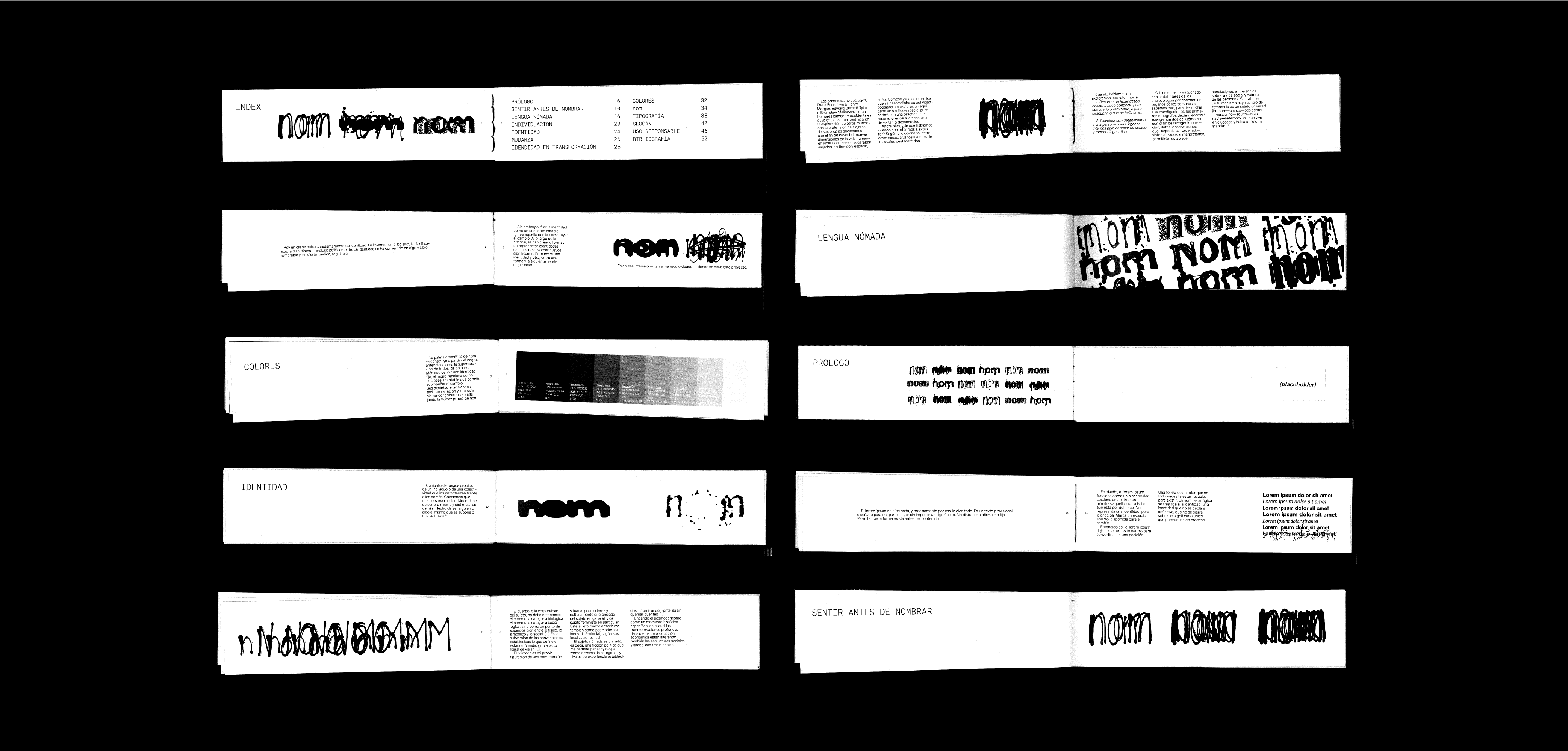
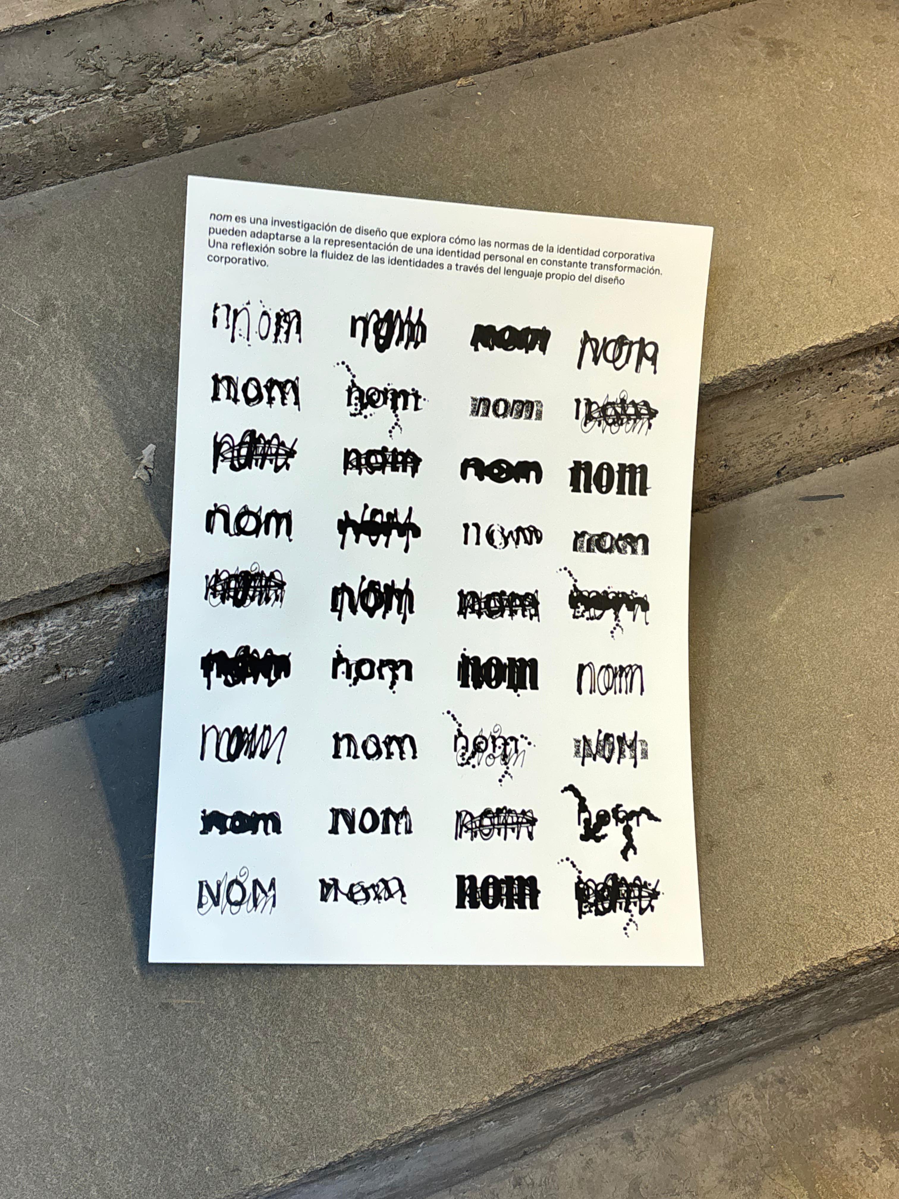
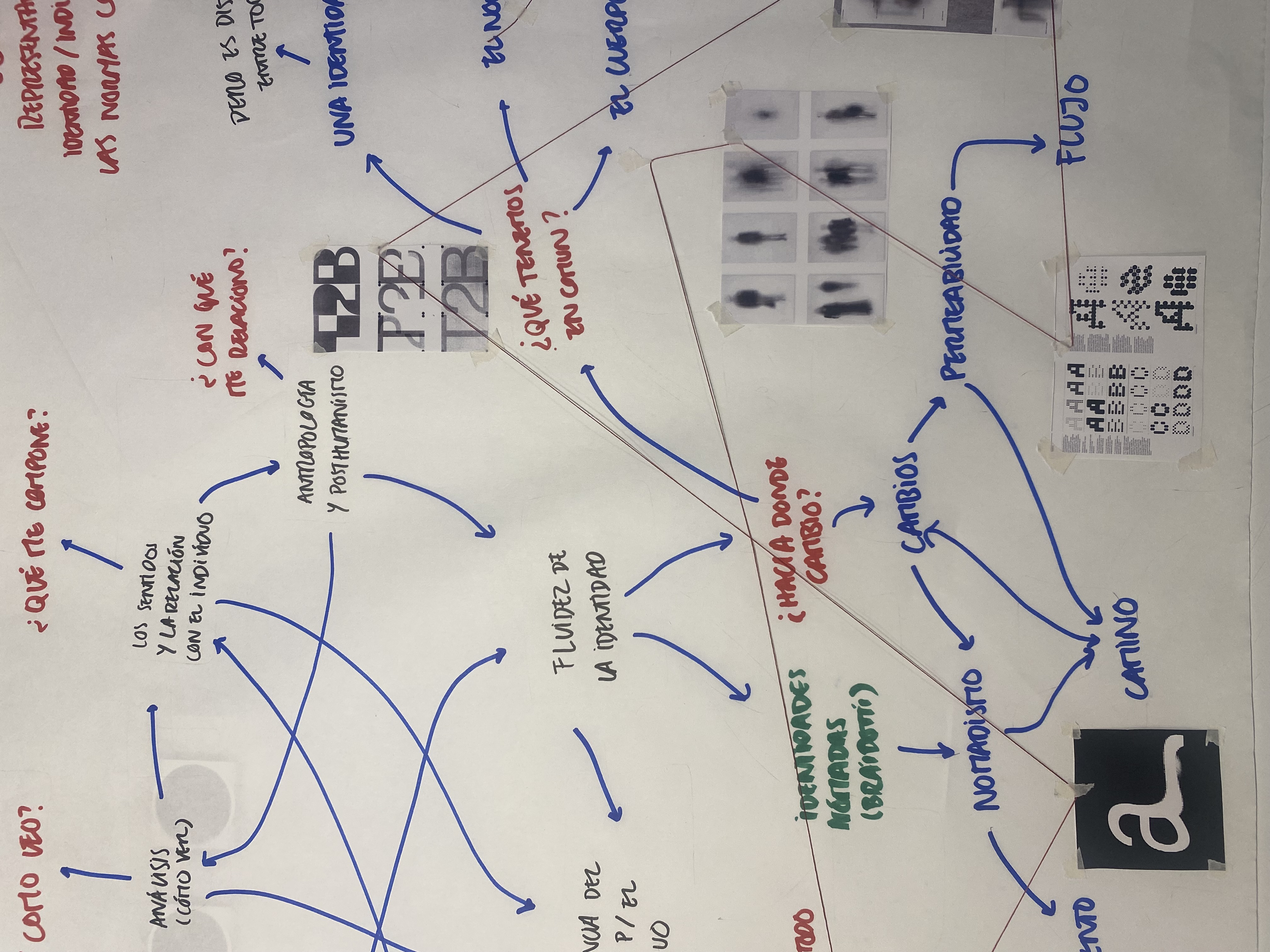
nom is a design research project that explores the fluidity of personal identities through the visual language of corporate branding.
Nom is the Catalan word for name. Developed during my Erasmus in Barcelona, the project began with a simple question: if we are constantly changing, why should our visual identities remain fixed?
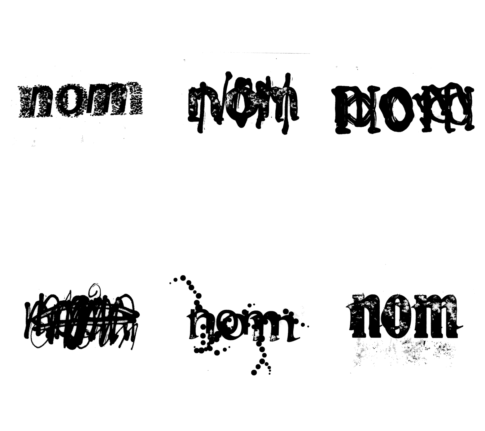
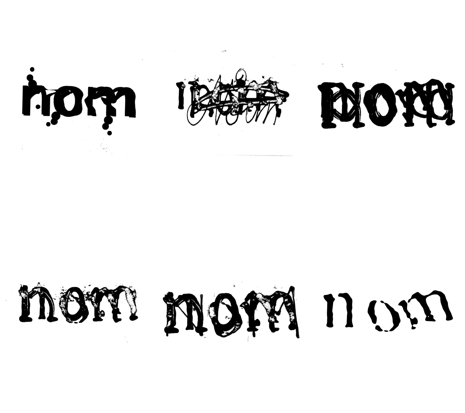
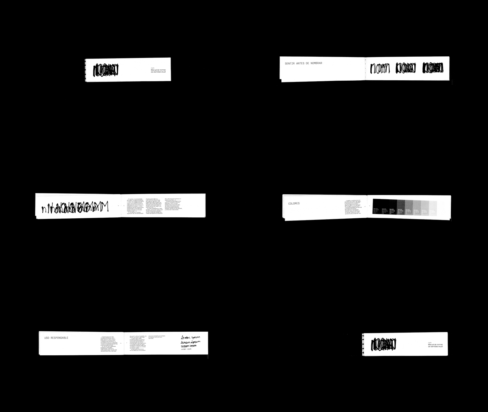
Borrowing the language of corporate branding, from visual systems and typography to colour palettes and brand guidelines, nom proposes an identity designed to evolve over time. Instead of relying on a single, static logo, the system embraces variation as one of its defining principles.
The logo is never exactly the same twice. Layered, distorted or fragmented, it remains recognisable while continuously changing, much like personal identity itself.